Custom dashboard protects a national brand from ‘creative’ franchisees

What was
The Problem

With over 50 administrators across the multisite, maintaining a consistent brand experience across the entire network was an important challenge to overcome. Each site has its own contact information, calls to action, regional map, and location pins displayed prominently in several locations on each regional site.

What is
The Solution

Data-entry dashboard

To simplify the work of managing each site while building a consistent brand aesthetic across the network, we created a simple dashboard on each site that remains connected to the multisite database. Good looks? Check. Limited ability for non-designers to put their “creative” twists on our beautiful designs? Also check.

pasted image 0

The power of a single page

While each site in the network is able to choose which pages display a call-to-action, a map, or many other variables, it was important to make site-wide changes a breeze. That’s why we created a single user interface to allow administrators to swap out key text and links without needing to access the technically-complex parts of the WordPress theme.

microage region settings

Multilingual support

Not only did regional administrators need an easy-to-manage interface for each site, but the content needed to be structured, interpreted, and displayed in multiple languages. Every step of the project allowed for maximum linguistic freedom, from simple buttons to dynamically linked multisite content.

microage contact details

Hiding gaps in data entry

What happens when a content manager goes rogue? We’ve already planned for that. We thought ahead to ensure that each site on the network would look great, regardless of whether there’s one phone number, several or none at all. All our designs conditionally display data based on how the data is entered. Say no to broken templates!

microage map config
microage map result

Smart and connected

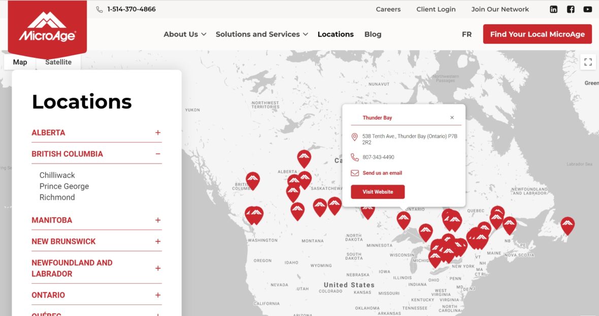
As if this dashboard wasn’t already user-friendly enough, we went one step further. Since the location-related data used to populate each site’s map already exists on the national site, we turned this into a simple menu. Select your location and your map is in business!

Talk to us today
If you’re ready to build a scalable, fully-featured LMS or simply need support to bring your current platform to the next level, Tangible has the right people for the job. Every site is unique, so give us a call to find out how we can help.
Contact our LMS experts

More Case Studies…

AI course content recommendations

  • Adaptive & personalized learning
  • Content library
  • Custom integrations
  • Custom user interface
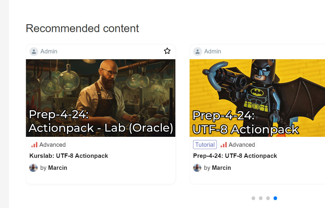
A slider interface showcasing recommended LMS-related content

Course webinars & events in LearnDash

  • Blended & Hybrid Learning
  • Custom user interface
  • LearnDash
Screenshot that shows the results of course pppointments

Creating a Learning Path interface that doesn’t overwhelm

  • Custom user interface
  • LearnDash
  • Content library
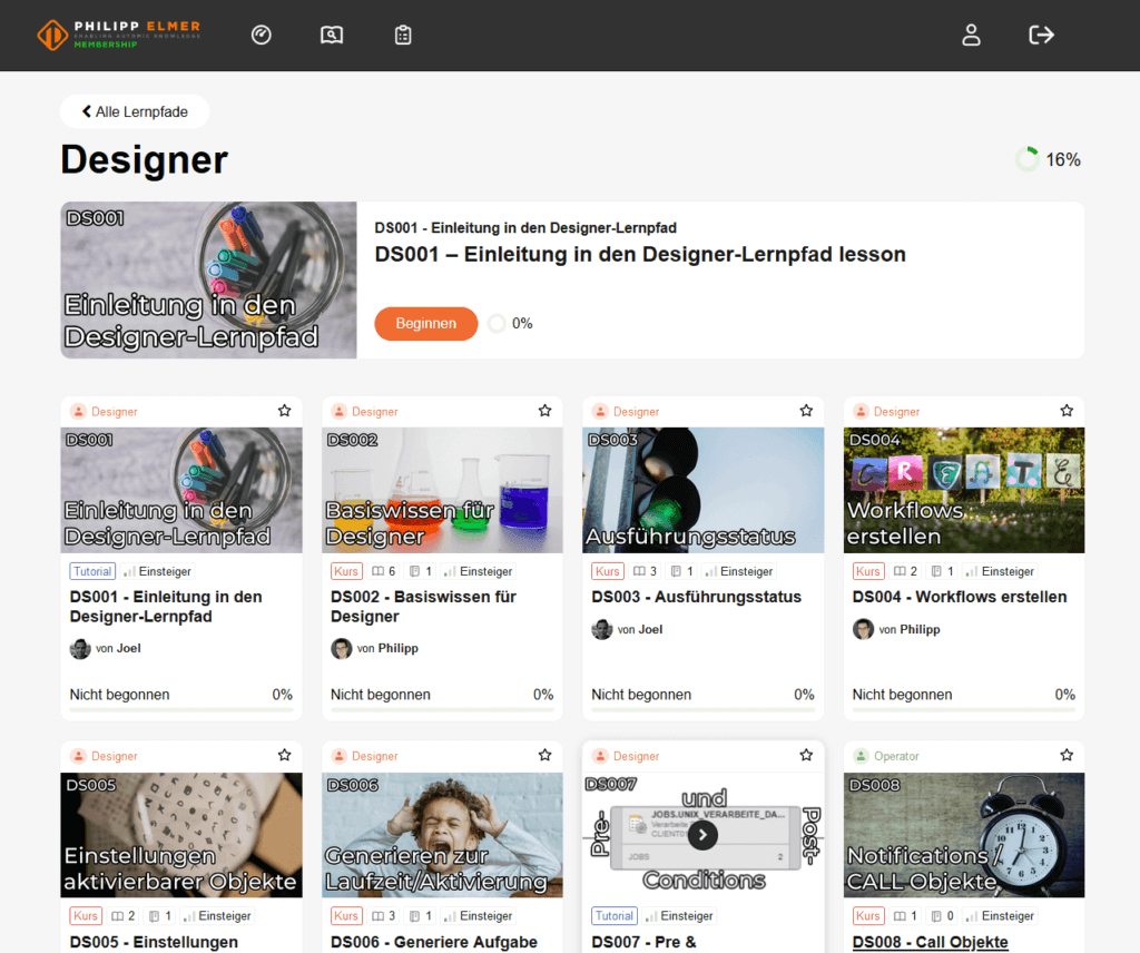
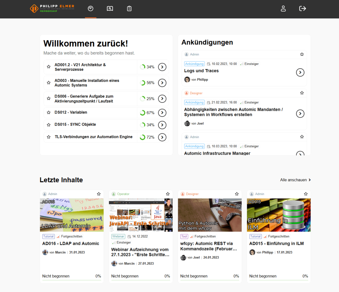
A screenshot of the new individual learning path layout on the Philipp Elmer membership site

Easing teachers into remote learning during the pandemic

  • Blended & Hybrid Learning
  • Goal setting & tracking
  • Adaptive & personalized learning
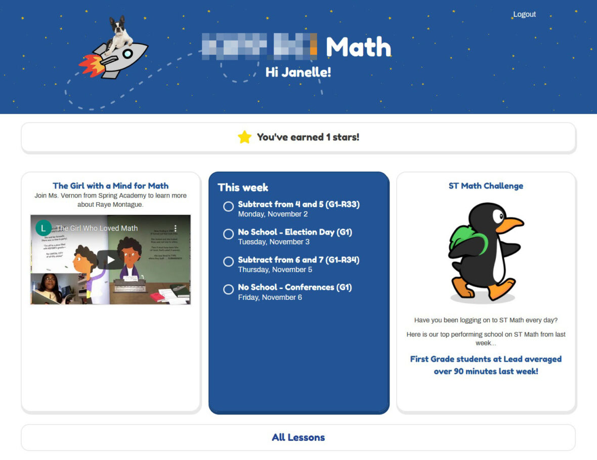
Screenshot of a student dashboard

Empowering police sergeants to track offline officer training

  • Administrative reporting
  • Offline learning
  • Custom user interface
  • Cohort learning
  • Rostering & classroom management
Inline training logging interface

How a DC school district took their curriculum online

  • LearnDash
  • Rostering & classroom management
  • Custom user interface
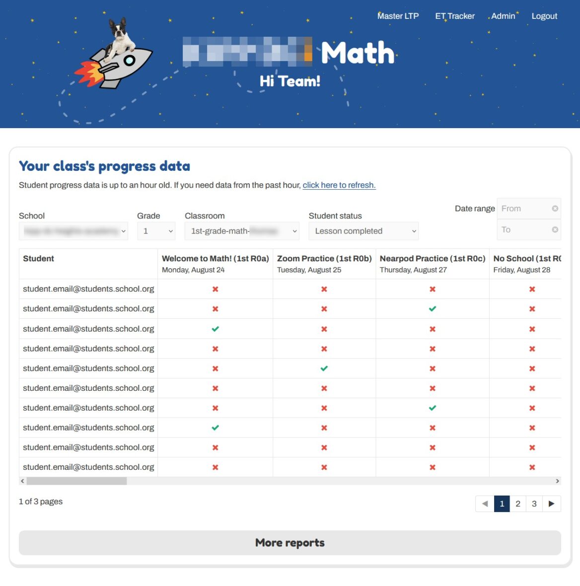
Screenshot that shows the class progress data

How a non-profit scaled its LearnDash LMS to 300k+ users

  • LearnDash
  • Administrative reporting
  • Custom integrations
  • Data import/export
How a non-profit scaled its LearnDash LMS to 200k+ users

LearnDash blended self-paced & appointment-based courses

  • Blended & Hybrid Learning
  • WooCommerce
  • LearnDash
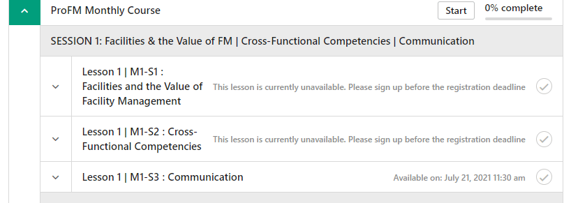
Screenshot that shows the results of course pppointments

LMS progress bar that shows completion across all enrolled courses

  • Content library
  • Custom user interface
  • LearnDash
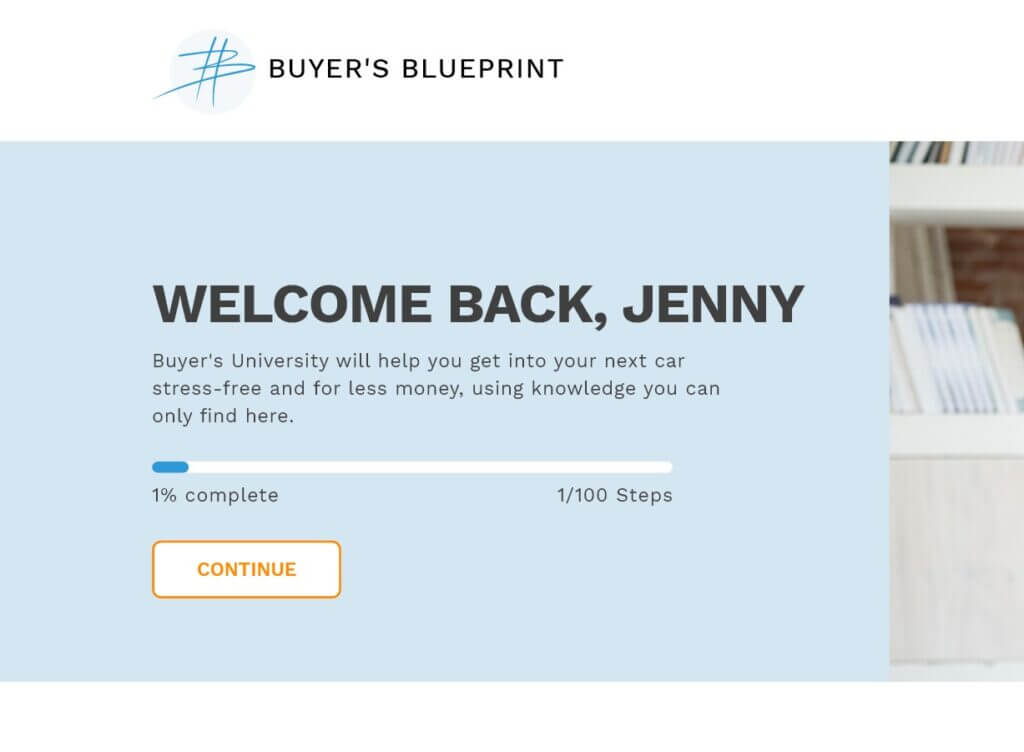
Screen shot showing LMS progress bar

Making Uncanny Groups work in a K-12 setting

  • Administrative reporting
  • LearnDash
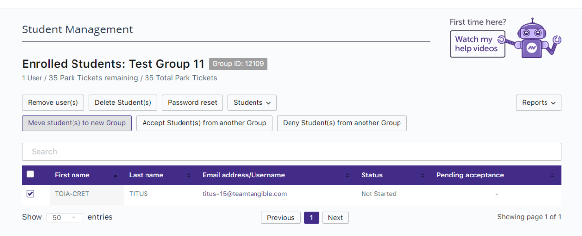
Screenshot showing group management

Modelling LearnDash groups after real-life classrooms

  • E-commerce
  • LearnDash
  • Rostering & classroom management
  • Registration & onboarding
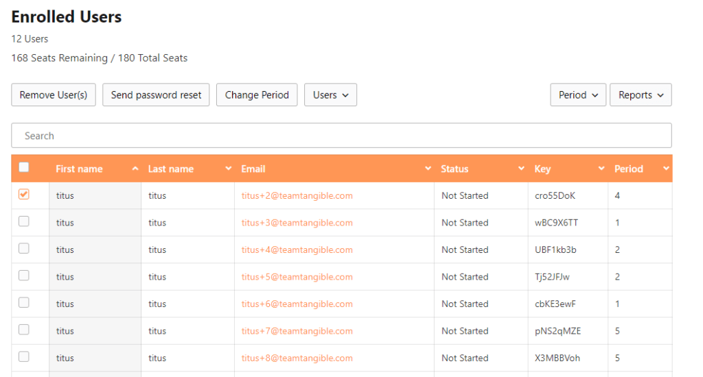
Screenshot showing a list of enrolled users with their first name, last name, email, and status, as well as the number of seats remaining out of the total number of seats.

One student dashboard for everything

  • Custom user interface
  • LearnDash
An image showing lms gamification dashboard

Turning LMS content into a group presentation at the click of a button

  • Gamification
  • Blended & Hybrid Learning
  • Goal setting & tracking
Group presentation of a lesson