Simplifying a dashboard to show users exactly what they need

We designed an intuitive custom content recommendation interface
  • Custom user interface
  • LearnDash

Content Overload
The Problem

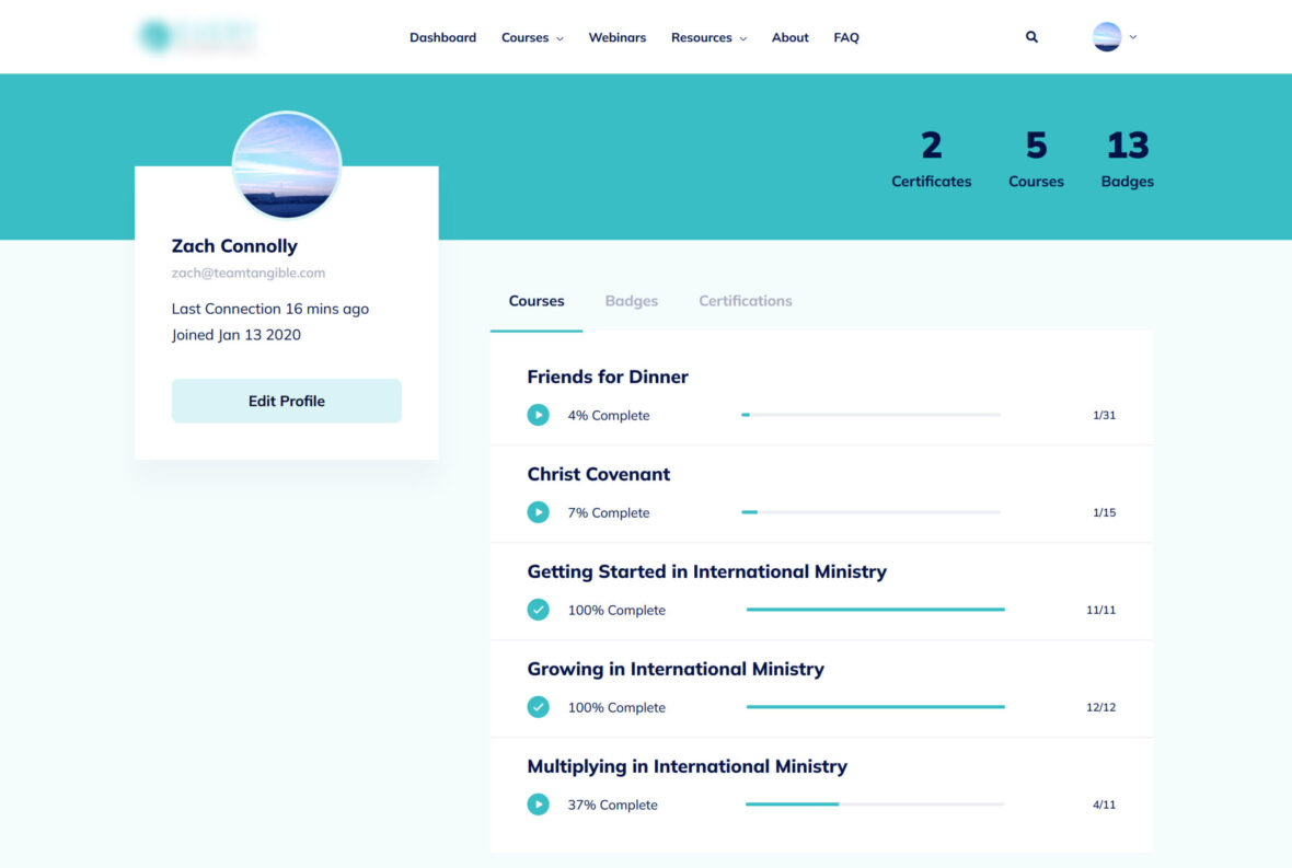
Our client’s user dashboard needed a refresh. When they first launched their LMS they had far fewer courses and so designed an interface that would surface their material in multiple categories, filling out the page nicely. As the client added to their content library, however, users started struggling to find what they were looking for, being met on login with a dizzying nearly two dozen collapsible sections with sliders, some containing as many as 100 pieces of content.

This dashboard served the site well when there was less content, with courses appearing in multiple categories.

A visually optimized experience
The Solution

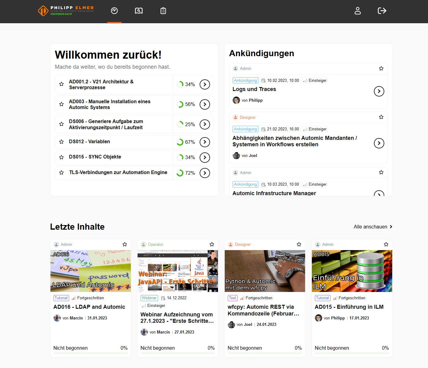
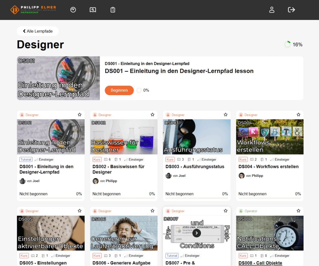
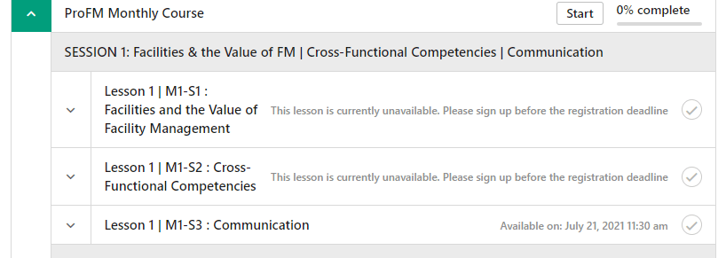
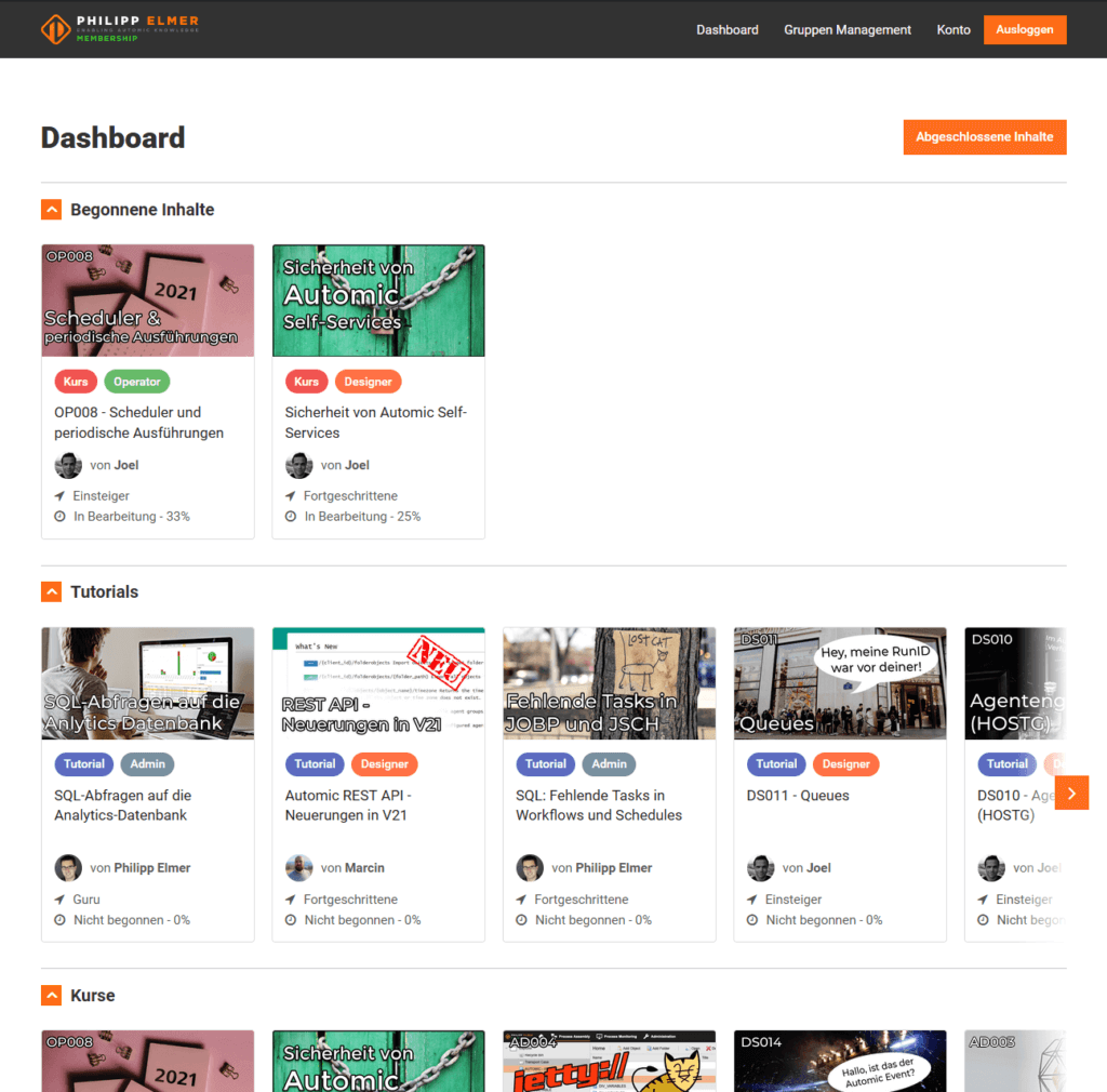
To help users find what they’re looking for, we prioritized a smaller subset of content to show the user upon login, moving the rest to a new content library interface and spinning out learning paths into their own interface.

In-progress courses and time-sensitive upcoming live training are given the highest priority, followed by recently published content, and content marked as “favorite” by the user.

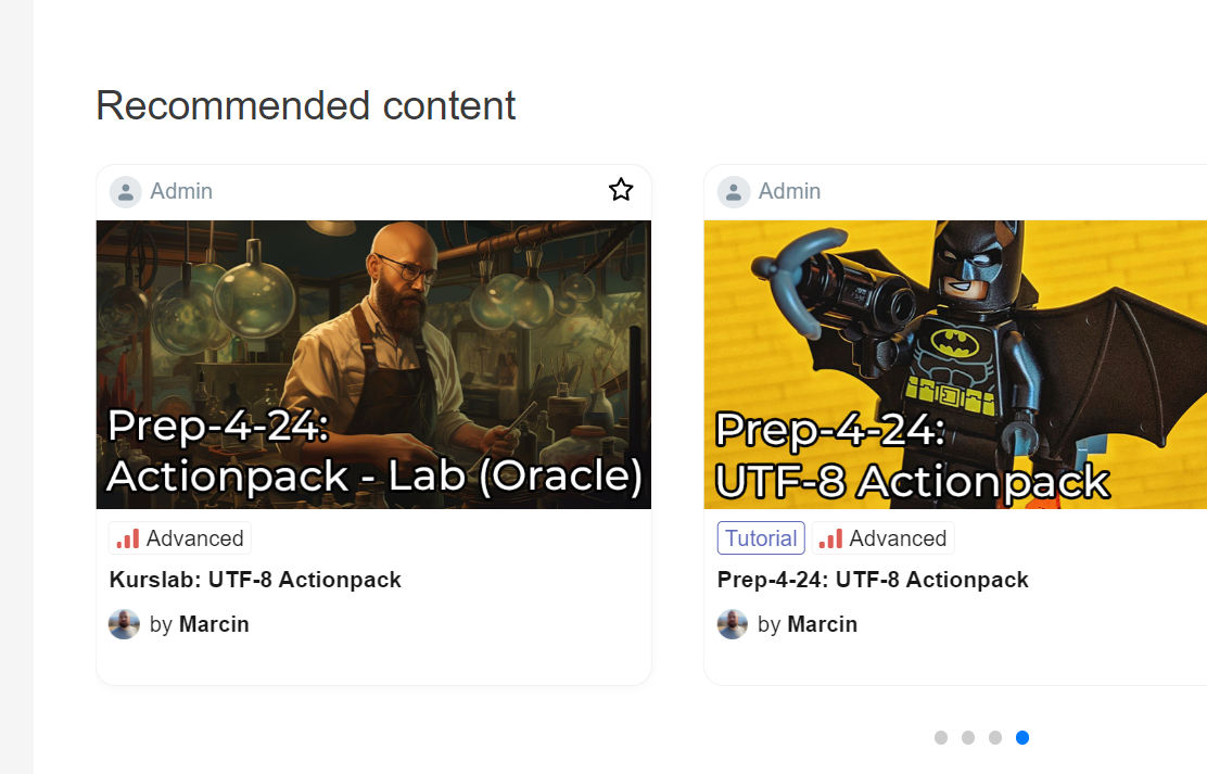
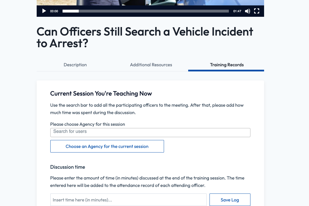
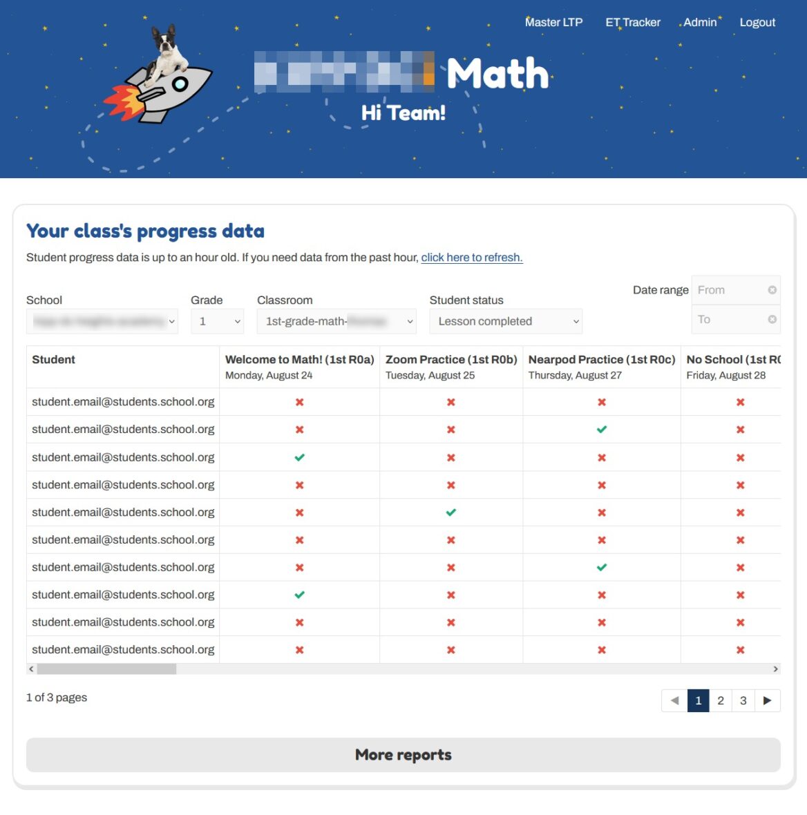
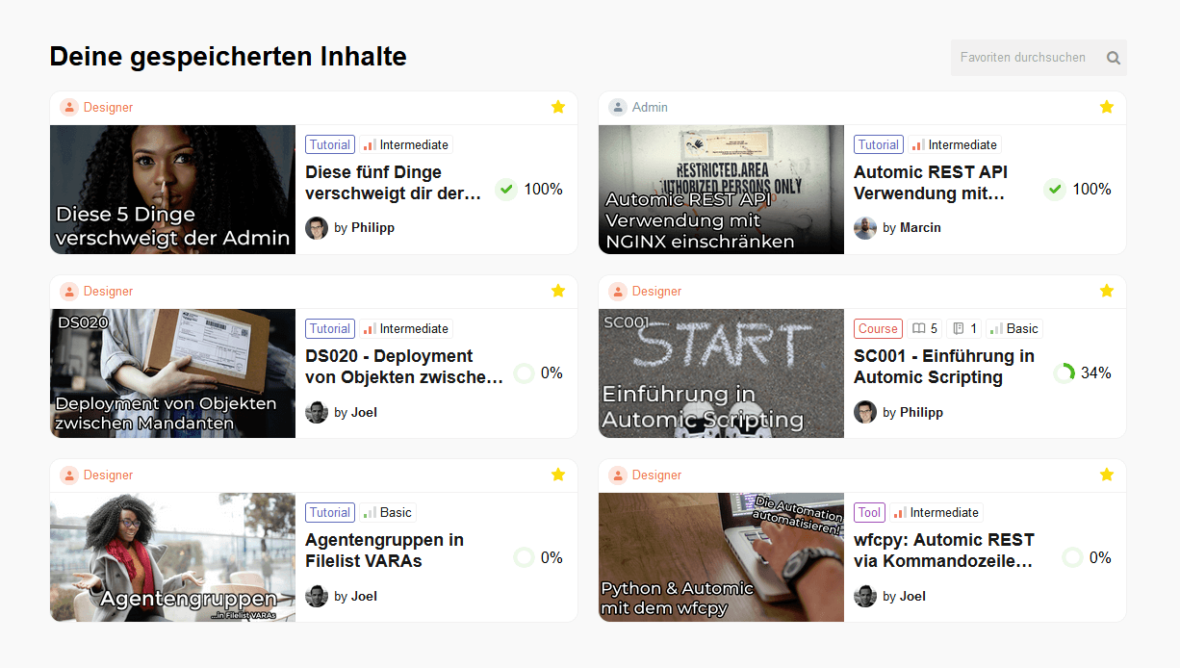
The cards are also redesigned to support multiple layout types, to better organize metadata for improved legibility, to show customized meta-data for different content types, and to have more pronounced hover-states. The new design language is more simple and subtle in its use of color to put the content at the forefront.

Now the dashboard features in-progress courses, upcoming scheduled live content, new content, and user-defined favorites
Talk to us today
If you’re ready to build a scalable, fully-featured LMS or simply need support to bring your current platform to the next level, Tangible has the right people for the job. Every site is unique, so give us a call to find out how we can help.
Contact our LMS experts

More Case Studies…

Course webinars & events in LearnDash

  • Blended & Hybrid Learning
  • Custom user interface
  • LearnDash

Creating a Learning Path interface that doesn’t overwhelm

  • Custom user interface
  • LearnDash
  • Content library
A screenshot of the new individual learning path layout on the Philipp Elmer membership site

Easing teachers into remote learning during the pandemic

  • Blended & Hybrid Learning
  • Goal setting & tracking
  • Adaptive & personalized learning

How a DC school district took their math curriculum online while keeping it easy to manage

  • LearnDash
  • Rostering & classroom management
  • Custom user interface

How a non-profit scaled its LearnDash LMS to 200k+ users

  • LearnDash
  • Administrative reporting
  • Custom integrations
  • Data import/export

LearnDash blended self-paced & appointment-based courses

  • Blended & Hybrid Learning
  • WooCommerce
  • LearnDash

LearnDash groups for Schools divided into “classrooms” with several classes of students

  • E-commerce
  • LearnDash
  • Rostering & classroom management
  • Registration & onboarding

LMS progress bar that shows completion across all enrolled courses

  • Content library
  • Custom user interface
  • LearnDash

Making Uncanny Groups work in a K-12 setting

  • Administrative reporting
  • LearnDash

One student dashboard for everything

  • Custom user interface
  • LearnDash

Turning LMS content into a live group presentation at the click of a button

  • Gamification
  • Blended & Hybrid Learning
  • Goal setting & tracking