LearnDash’s Focus Mode feature is designed to give learners a distraction‑free environment so that they can focus on their course content. For many LMS sites, this default experience works well. But the default Focus Mode layout doesn’t work well for all sites, especially if your programs are media‑rich in content or your site uses a distinctive color palette or design system that clashes with the default LearnDash styling.
Out of the box, Focus Mode overrides the site header, applies a new layout including sidebar navigation, and offers limited support for wide or full‑width content. This can leave visually complex courses feeling cramped, and it disconnects learners from the rest of the site. Brand styling is stripped away and is replaced with LearnDash’s lightly-customizable default look, navigation becomes less intuitive, and the overall user experience (UX) can suffer.
For these (and other) reasons, we’ve been approached by quite a few clients over the years who wanted Focus Mode customized to better fit their brands and to improve the experience for their learners
LearnDash’s Focus Mode can be enabled by navigating to LearnDash LMS > Settings > General tab, and toggling on the “Focus Mode” setting, which is visible if you’ve set your active template to “LearnDash 3.0” (default setting on new installations).
What Focus Mode Does Well — And Where It Falls Short
What makes Focus Mode appealing is its ability to strip away distractions and help keep learners immersed in their course content. By hiding the theme’s header, footer, and other elements, it creates a clean, single‑column layout with streamlined navigation. For straightforward courses—like text lessons or simple video modules—this out‑of‑the‑box experience works well. Learners get a consistent interface, minimal clutter, and a clear path through the course.
Although it’s a quick method of enhancing the user experience, Focus Mode isn’t a perfect fit for every WordPress LMS. For sites with strong branding, media-heavy courses with lots of visuals and video, or complex course structures, its default design can feel restrictive. The global header override makes the LMS feel visually separate from the rest of the website, removing site navigation and leaving only lesson navigation. This can confuse learners moving between the LMS and other resources. The layout also imposes fixed content constraints, limiting support for wide or full-width blocks, often displaying interactive content like H5P, xAPI/SCORM modules, or detailed visuals at smaller sizes or distorted proportions.

Ultimately, Focus Mode is great for delivering a distraction‑free experience, but without customization, it can work against branding and UX goals for more advanced LMS programs. Good UX isn’t always about minimalism. It’s about giving learners the right tools and context, exactly when they need them. Out‑of‑the‑box, Focus Mode reduces distractions, but it can remove helpful branding, navigation, or content flexibility that actually improves the learner experience.
Restoring Your Theme Header in LearnDash Focus Mode
Earlier we mentioned that the LearnDash Focus Mode replaces your site’s header with its own layout. This is great if you want a totally distraction-free environment, but it also means learners lose access to your global navigation and any custom elements your theme provides. For brands with strong visual identity or important utility links, this sudden change can feel jarring — almost like the learner has been dropped onto a different site.

That’s because the Focus Mode header template (/ld30/focus/header.php) doesn’t use WordPress’s usual get_header() function. Instead, it loads a barebones header structure and skips all the theme hooks that normally output your logo, menu, or call-to-action banner.
<html <?php language_attributes(); ?>
	<head>
		<meta charset="<?php bloginfo( 'charset' ); ?>">
		<meta name="viewport" content="width=device-width, initial-scale=1">
		<link rel="profile" href="http://gmpg.org/xfn/11">
		<?php
		wp_head();
		/**
		 * Fires in the head tag in focus mode.
		 *
		 * @since 3.0.0
		 */
		do_action( 'learndash-focus-head' );
		?>
	</head>
	<body <?php body_class(); ?>>

		<div class="<?php echo esc_attr( learndash_the_wrapper_class() ); ?>">
			<?php
				/**
				 * Filter Focus Mode sidebar collpases.
				 *
				 * @since 3.0.0
				 *
				 * @param bool false Wether to collapse Focus Mode sidebar. Default false.
				 */
			?>
			<div class="ld-focus ld-focus-initial-transition <?php echo esc_attr( apply_filters( 'learndash_focus_mode_collapse_sidebar', false ) ? 'ld-focus-sidebar-collapsed ld-focus-sidebar-filtered' : '' ); ?> <?php echo esc_attr( learndash_30_get_focus_mode_sidebar_position() ); ?>">
				<?php
				/**
				 * Fires at the start of the focus template.
				 *
				 * @since 3.0.0
				 *
				 * @param int $course_id Course ID.
				 */
				do_action( 'learndash-focus-template-start', $course_id ); ?>
      </div>
    </div>
  </body>
</html>
We can bring those theme elements back with some customization. For example, in the Kadence theme we’ve used on a few of these customization projects, that meant adding a few familiar hooks directly into the Focus Mode header template:
do_action( 'kadence_before_header' );
do_action( 'kadence_header' );
do_action( 'kadence_after_header' );
Which would result in something like:
<html <?php language_attributes(); ?>>
	<head>
		<meta charset="<?php bloginfo( 'charset' ); ?>">
		<meta name="viewport" content="width=device-width, initial-scale=1">
		<link rel="profile" href="http://gmpg.org/xfn/11">
		<?php
		wp_head();
		/**
		 * Fires in the head tag in focus mode.
		 *
		 * @since 3.0.0
		 */
		do_action( 'learndash-focus-head' );
		?>
	</head>
	<body <?php body_class(); ?>>

		<div class="<?php echo esc_attr( learndash_the_wrapper_class() ); ?>">
			<?php
			/**
			 * Kadence before header hook.
			 *
			 * @hooked kadence_do_skip_to_content_link - 2
			 */
			do_action( 'kadence_before_header' );

			/**
			 * Kadence header hook.
			 *
			 * @hooked Kadence/header_markup - 10
			 */
			do_action( 'kadence_header' );

			do_action( 'kadence_after_header' );
			?>
			<?php
				/**
				 * Filter Focus Mode sidebar collpases.
				 *
				 * @since 3.0.0
				 *
				 * @param bool false Wether to collapse Focus Mode sidebar. Default false.
				 */
			?>
			<div class="ld-focus ld-focus-initial-transition <?php echo esc_attr( apply_filters( 'learndash_focus_mode_collapse_sidebar', false ) ? 'ld-focus-sidebar-collapsed ld-focus-sidebar-filtered' : '' ); ?> <?php echo esc_attr( learndash_30_get_focus_mode_sidebar_position() ); ?>">
				<?php
				/**
				 * Fires at the start of the focus template.
				 *
				 * @since 3.0.0
				 *
				 * @param int $course_id Course ID.
				 */
				do_action( 'learndash-focus-template-start', $course_id ); ?>
With this tweak, the Focus Mode header matches the rest of the site — learners can still jump to key areas without losing the “focused” feel of the page.

If you’re not on Kadence, the same idea applies: find your theme’s header hooks (or use get_header() directly) and reintroduce them into the Focus Mode header template. For a truly seamless experience, you can keep the header slim in Focus Mode, hiding less-essential items with CSS so branding and navigation remain intact without adding clutter.
Customizing LearnDash’s Focus Mode Styling to Match Your LMS Theme
When Focus Mode replaces all but your site’s accent color, font sizes, surface treatments, and spacing with LearnDash default styles, the change can feel jarring, especially for sites with a strong visual identity. While this works fine for many LMS setups, it can clash with a site that has an established brand look or a specific colour palette. Suddenly switching to LearnDash’s default styles can make the LMS feel disconnected from the rest of the site.
Here’s where customization comes in. We can replace Focus Mode’s default colors, typography, and spacing with the brand’s own styling system. This meant that lesson headings, progress bars, buttons, and tabs all matched the rest of the site, giving learners a seamless experience whether they were browsing resources, taking a course, or completing a quiz. We’ll share some examples here:
Adjust border radius on focus mode buttons
:root .learndash-wrapper:not(.ld-registration__outer-wrapper) .ld-button,
:root .learndash-wrapper .learndash_mark_complete_button,
:root .learndash-wrapper .wpProQuiz_button,
:root .learndash-wrapper .wpProQuiz_content a#quiz_continue_link,
:root .learndash-wrapper .ld-focus-comments .form-submit #submit {
	border-radius: 5px;
}
Adjust color of active and hovered lesson sidebar navigation titles
:root .learndash-wrapper .ld-lesson-item.ld-is-current-lesson .ld-lesson-title, :root .learndash-wrapper .ld-lesson-item .ld-lesson-title:hover, :root .learndash-wrapper .ld-lesson-item .ld-lesson-title:focus {
	color: #0e6361 !important;
}
Style breadcrumbs to make current page unclickable, and add hover styles to ancestors

:root .learndash-wrapper .ld-breadcrumbs a {
	color: #888 !important;
}
:root .learndash-wrapper .ld-breadcrumbs a:hover,
:root .learndash-wrapper .ld-breadcrumbs a:focus {
	color: #009691 !important;
}

:root .learndash-wrapper .ld-breadcrumbs .ld-breadcrumbs-segments span:last-child a {
	pointer-events: none;
	color: #000 !important;
}
Use light tan background color on content, and white on cards/panels
:root .learndash-wrapper .ld-focus .ld-focus-main,
:root body.ld-in-focus-mode .learndash-wrapper,
body.ld-in-focus-mode {
	background-color: #f9f2e2;
}

:root .learndash-wrapper .ld-table-list {
	background-color:#fff;
}
:root .learndash-wrapper .ld-breadcrumbs,
:root .learndash-wrapper .ld-lesson-status {
background: #fff;
}
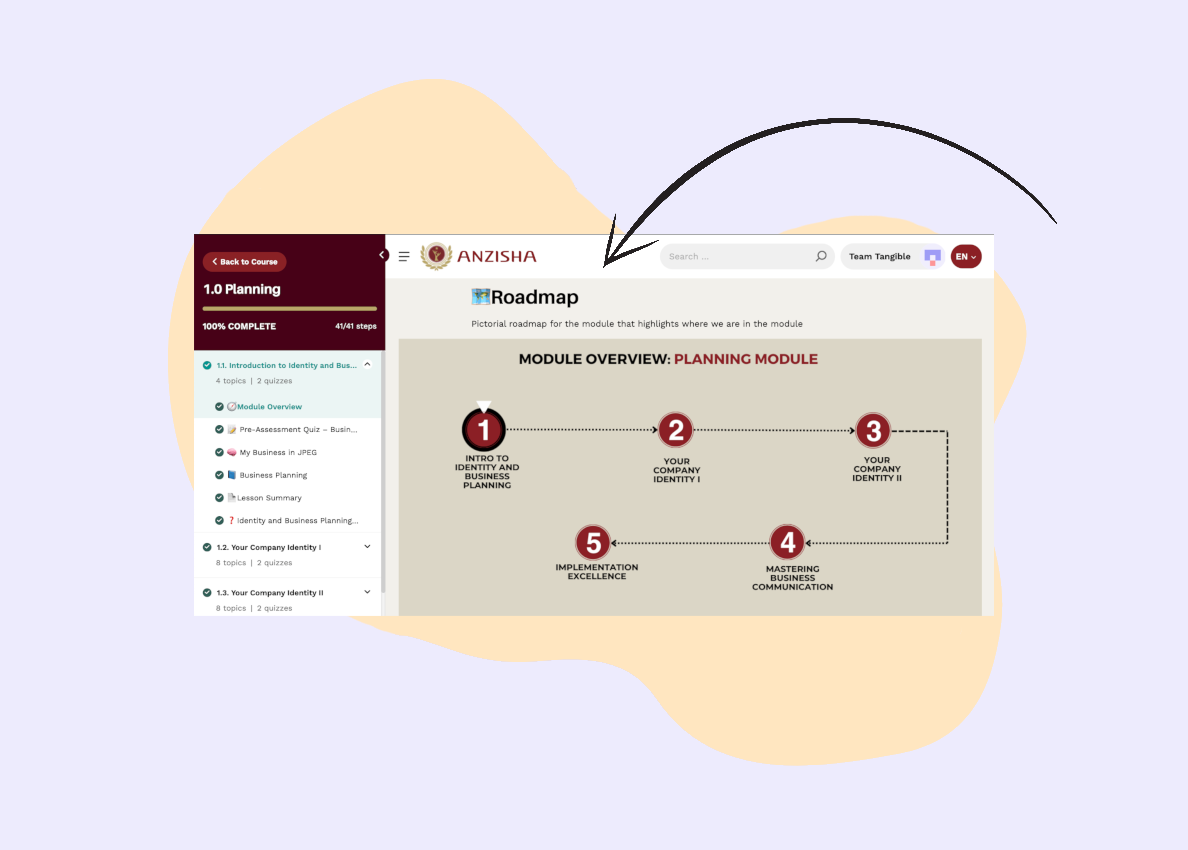
Optimizing LearnDash Focus Mode for Wide and Full-Width Content
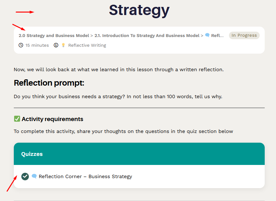
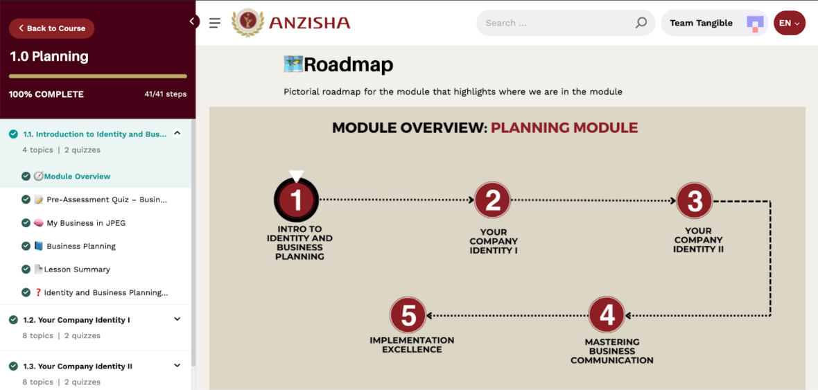
From a design standpoint, Focus Mode’s fixed column width can be limiting. That’s fine for simple text or small images, but it can feel cramped when you’re working with rich media like interactive H5P activities, xAPI/SCORM modules, large data tables, or detailed images that need room to breathe.
On projects like Anzisha, we extended (with some custom CSS) Focus Mode’s layout to better support WordPress’s native wide and full-width block alignments. This gave us the flexibility to keep normal text comfortably readable while letting certain elements expand across more of the screen. For example:
- Full-width for section banners, key calls-to-action, or content dividers
- Wide for interactive activities or high-resolution visuals where detail matters
Our approach was simple: define CSS variables for standard, wide, and full widths, then adjust Focus Mode’s content container so that .alignwide and .alignfull blocks display as intended from the Block Editor. We also made sure to exclude the WordPress search page from these styles — a quirk in some LearnDash versions can accidentally apply Focus Mode classes there.
/* Set up CSS variables for normal and wide content widths, and inline (left and right) and block (top and bottom) padding. To customize spacing, simply adjust these values as needed */
:root body.ld-in-focus-mode:not(.search) {
  --focus-content-width: 800px;
  --focus-wide-width: 1400px;
  --focus-inline-padding: 1.5rem;
  --focus-block-padding: 4rem;
}

/* Stretch the LearnDash focus mode content area to fill all available space. Individual component widths will be constrained individually below */
:root body.ld-in-focus-mode:not(.search) .ld-focus .ld-focus-main .ld-focus-content {
  width: 100%;
  max-width: 100%;
  padding: var(--focus-block-padding) var(--focus-inline-padding);
}
/* Style blocks that have neither the alignfull nor the align wide classes applied. Auto margin is applied to center content in the available space */
:root body.ld-in-focus-mode:not(.search) .ld-focus .ld-focus-main .ld-focus-content .ld-tab-content > *:not(.alignfull):not(.alignwide) {
  max-width: var(--focus-content-width);
  margin-left: auto;
  margin-right: auto;
}
/* Style align wide blocks to fill available space until they've reached the defined wide width */
:root body.ld-in-focus-mode:not(.search) .ld-focus .ld-focus-main .ld-focus-content .ld-tab-content .alignwide {
  max-width: var(--focus-wide-width);
  width: 100%;
  margin-left: auto;
  margin-right: auto;
}
/* Style align full blocks to stretch to the edges of the available content area. Negative margin and larger than 100% wide to account for the padding applied to the ld-focus-content container */
:root body.ld-in-focus-mode:not(.search) .ld-focus .ld-focus-main .ld-focus-content .ld-tab-content .alignfull {
  margin-left: calc(-1 * var(--focus-inline-padding));
  margin-right: calc(-1 * var(--focus-inline-padding));
  width: calc(100% + var(--focus-inline-padding) + var(--focus-inline-padding));
}
/* Apply normal content width to LearnDash elements: title, status bar, tab navigation, footer actions, quiz content, comments, and alerts. You can wide-align these too if you like, by applying the --focus-wide-width variable instead */
:root body.ld-in-focus-mode:not(.search) .ld-focus .ld-focus-main .ld-focus-content > h1,
:root body.ld-in-focus-mode:not(.search) .ld-focus .ld-focus-main .ld-focus-content .learndash-shortcode-wrap,
:root body.ld-in-focus-mode:not(.search) .ld-focus .ld-focus-main .ld-focus-content .ld-tabs-navigation,
:root body.ld-in-focus-mode:not(.search) .ld-focus .ld-focus-main .ld-focus-content .ld-content-actions,
.learndash-wrapper .ld-focus .wpProQuiz_content,
.learndash-wrapper .ld-focus .ld-focus-main .ld-focus-content .ld-quiz-status,
.learndash-wrapper .ld-focus .ld-focus-main .ld-focus-content .ld-topic-status,
.learndash-wrapper .ld-focus .ld-focus-main .ld-focus-content .ld-lesson-status,
:root body.ld-in-focus-mode:not(.search) .ld-focus .ld-focus-comments,
:root body.ld-in-focus-mode:not(.search) .ld-focus .ld-alert {
  max-width: var(--focus-content-width);
  margin-left: auto;
  margin-right: auto;
}
The result is a Focus Mode layout that adapts to the content, not the other way around. Learners get an immersive, distraction-free view without sacrificing clarity or impact for rich, visual, or interactive course elements.
Want a Branded, UX‑Friendly LearnDash Focus Mode?
With these adjustments, learners get the best of both worlds: a distraction‑free interface that still feels like part of your site. Interactive content like H5P activities or large, detailed visuals displays properly, and the restored site header keeps your LMS experience consistent with the rest of your brand.
The best part? Achieving this level of customization doesn’t require heavy custom development—just thoughtful CSS and template adjustments.
At Tangible, we help LMS site owners and developers create learning experiences that work beautifully out of the box, while matching your program’s brand and content needs. If you want your LearnDash Focus Mode to be polished, branded, and truly learner‑friendly, we can help.
Let’s talk about how we can make your LMS experience as seamless and engaging as it should be.