We take pride in delivering creative services that capture the essence of our clients’ visions. For Intentions Plus, we crafted a series of logo concepts that embody their core values and dynamic approach. Our designs blend geometric precision with emotional resonance, symbolizing growth, support, and progress.
First concept
A geometric and balanced logo conveying the values of Intentions Plus and its hybrid learning model, halfway between the real and the virtual.
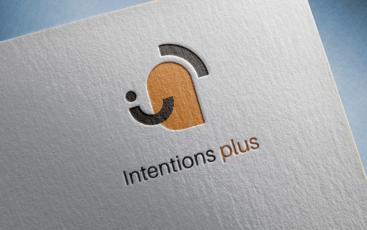
Duality
This logo represents the duality of training through the orange background, symbolizing discussion and exchange, and the shape of the black wave at the top, which brings direction, a sense of ascention, and progression. The black lines also represent the different learning paths that available to users.
Support
The logo also conveys an idea of support and emotional management through the black dot and the line located below it. Two images can be associated with it: either a character who cares, reassures, and accompanies with a benevolent arm gesture, or a smiling face.
Second concept
A logo that conveys dynamism and represent the action-oriented “plus” of Intentions Plus.
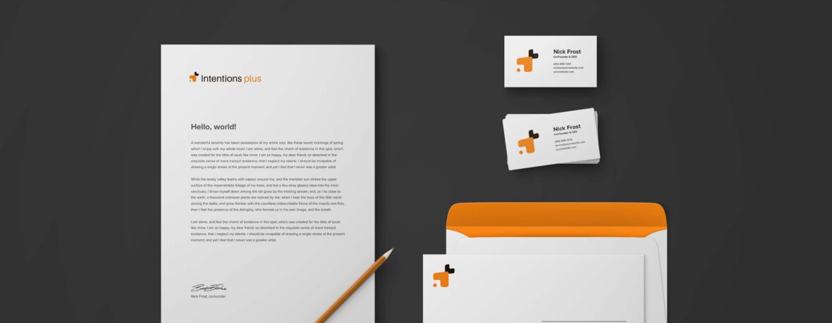
Action
This logo first represents the “plus” of Intentions Plus, indicating the transition toward action at the end of the training. It is broken down to offer different possible interpretations. The two arrows visually depict the concept of action and reaction.
Progression
The training acts as an inspiring experience for the learner, allowing them to grow and develop. The circle adds a human element to the logo. It is the eye of the person who is growing. Dynamism and progression are represented by the perspective and contrasting scale of the logo. It seems to come towards the viewer, to get closer, and to grow.
Third concept
A logo full of energy that takes its roots from the very structure of the training.
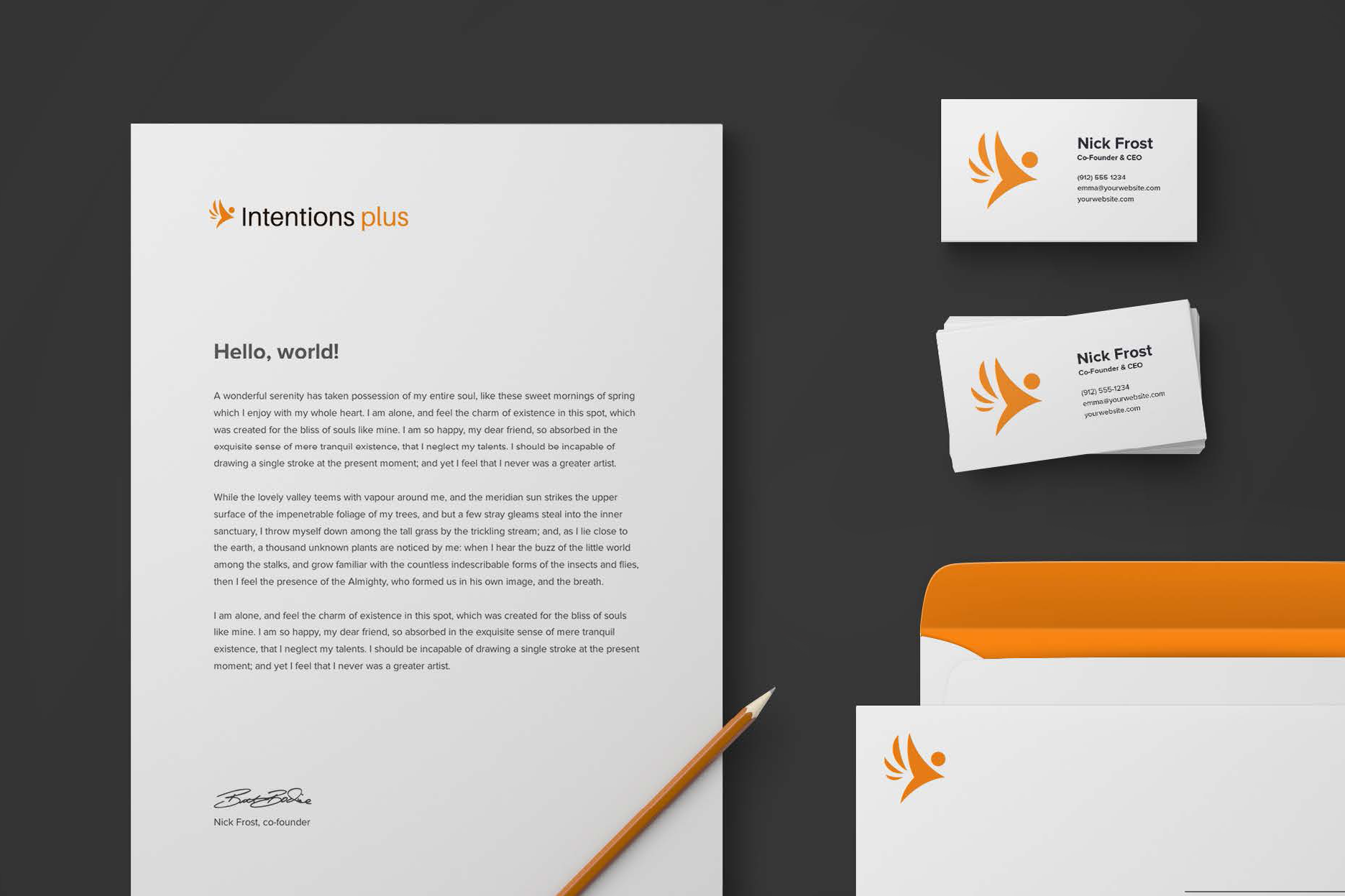
Ascension
This third logo proposal represents the idea of ascent and movement. The character seems to be propelled forward, as evidenced by the lines that follow them. However, other images and concepts can be found in this logo, such as that of support. The body of the character and the small lines may represent an outstretched hand symbolizing help and accompaniment.
Freedom
Perhaps wings, perhaps fingers reaching out, creating a negative space. In the void thus created, we can imagine paths, courses, that the user will be free to choose to reach their goal and develop.
If you’re ready to launch your new training brand like Intentions Plus or simple need a fresh look for your LMS, Tangible has the right people for the job. Every project is unique, so give us a call to find out how we can help.