A Dynamic Web Presence for an Academic Institution

A side-by-side view of the homepage and About Us page, showcasing a modern and professional design with structured navigation.

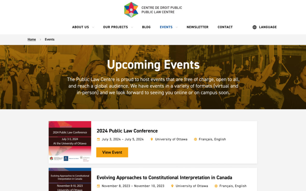
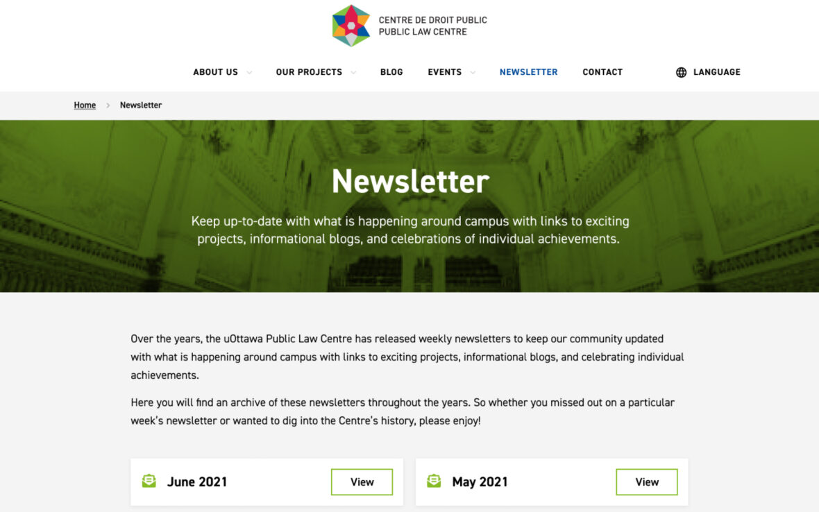
The website balances aesthetic appeal with practical usability, ensuring that every visitor finds what they need with ease.

A detailed overview of ongoing and past projects, visually organized to highlight key initiatives and accomplishments.
A profile page featuring an individual team member, complete with their bio, role, and contributions to the organization.
A structured blog post layout with clear typography, engaging visuals, and a sidebar for related articles.

Whether exploring projects, reading blog posts, or checking out upcoming events, the seamless structure and intuitive navigation create a frictionless user journey across desktop and mobile.

An interactive events page displaying a list of upcoming events with filters for easy navigation.
A dedicated newsletter subscription page, encouraging visitors to stay updated with the latest news and insights.

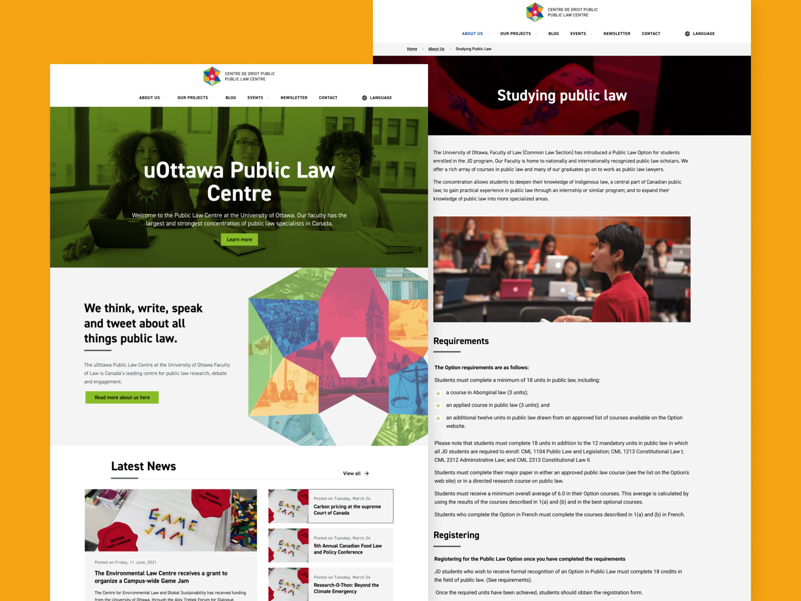
Mobile optimization plays a key role in the design. Every element adapts seamlessly to different screen sizes, ensuring accessibility across devices without compromising the overall experience.

A mobile-friendly version of the upcoming events page, optimized for easy scrolling and event discovery.
A section of the homepage on mobile, featuring a streamlined design with key highlights and CTAs.
A different section of the homepage displayed on mobile, showcasing responsive elements and intuitive navigation.